BOXED WATER
(ART DIRECTION + PRODUCT + LIFESTYLE)
Campaign concept:
"Beyond the Bottle: Boxed, Better, Brighter"
Presenting ‘Boxed Water Is Better’ in a diverse yet curated settings, will weave and build a narrative that resonates with the right target audiences. Which as a result fosters a connection between the brand and the values of sustainability and conscious living.
We understand how to relate to consumers and what they’re looking for when it comes to investing brands and loyalty.
Key messaging:
🌱 "Boxed Water Is Better: Sustainably Yours. Embrace a lifestyle that values simplicity, sustainability, and the beauty of our planet."
Overview
We’ve created the "Beyond the Bottle: Boxed, Better, Brighter" campaign aimed to position ‘Boxed Water Is Better’ as more than just a beverage; it's a lifestyle choice that aligns with a commitment to environmental responsibility and conscious living. The visuals convey a sense of modernity, simplicity, and a connection to nature, showcasing the brand in various settings to tell a compelling story of sustainability.
Visual Elements:
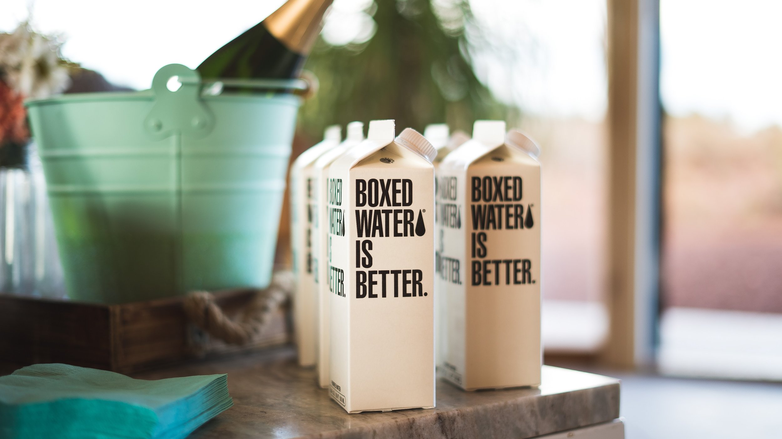
Narrative: sleek, modern environments.
Story: The elegance of enjoying Boxed Water fits seamlessly into a consumers lifestyle. Images showcase professionals, creatives, or trendsetters choosing Boxed Water in sleek offices, trendy coffee shops, or while commuting.
Outdoor adventure:
Narrative: A scenic outdoor setting, such as a mountain hike or a beach sunset.
Story: Boxed Water isn't just for city dwellers - nope it’s more than that. It's the perfect companion for those who appreciate the great outdoors. It’s about capturing moments of people enjoying Boxed Water during hikes, beach picnics, or while camping – emphasising its eco-friendly packaging in nature.
Style and aesthetics:
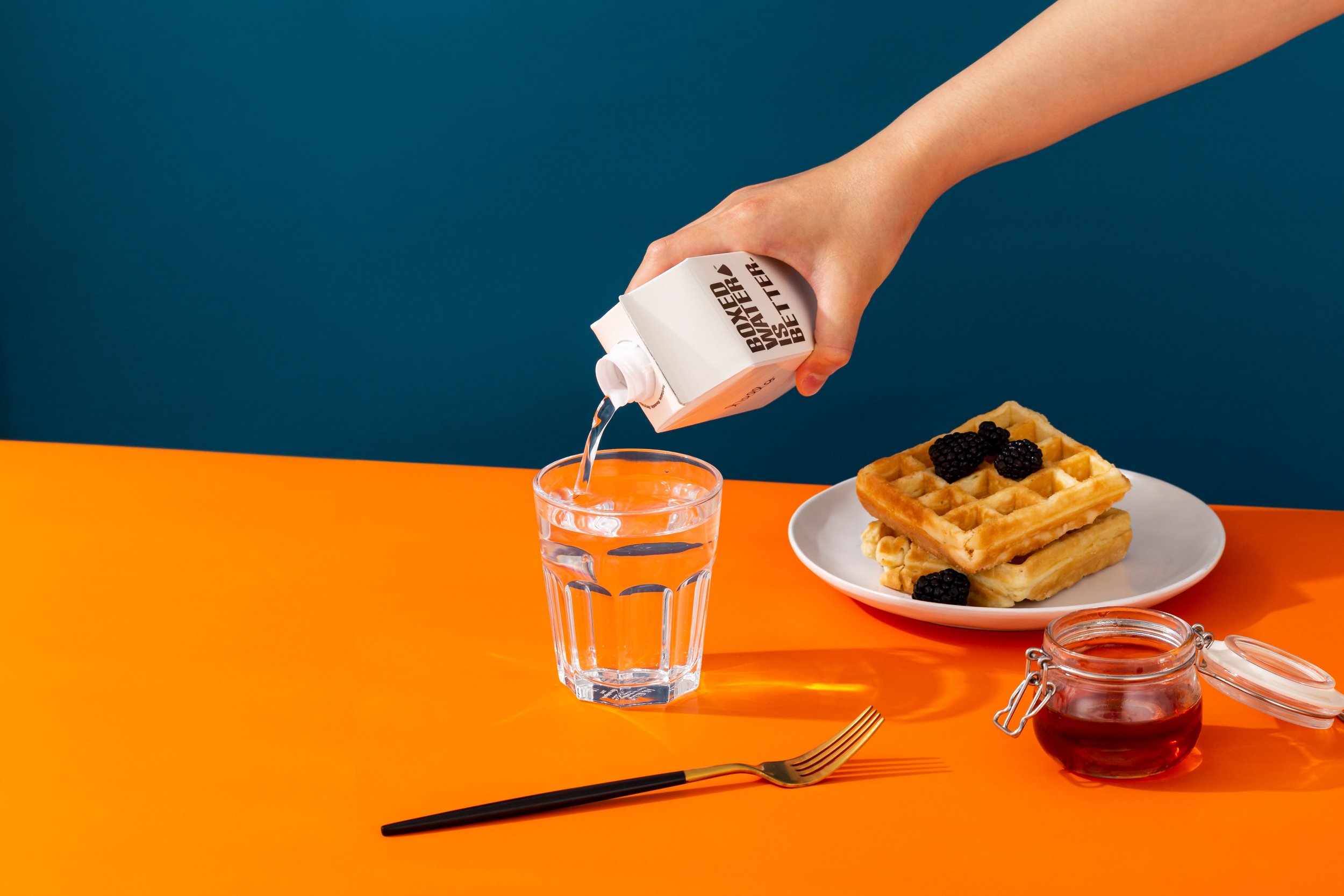
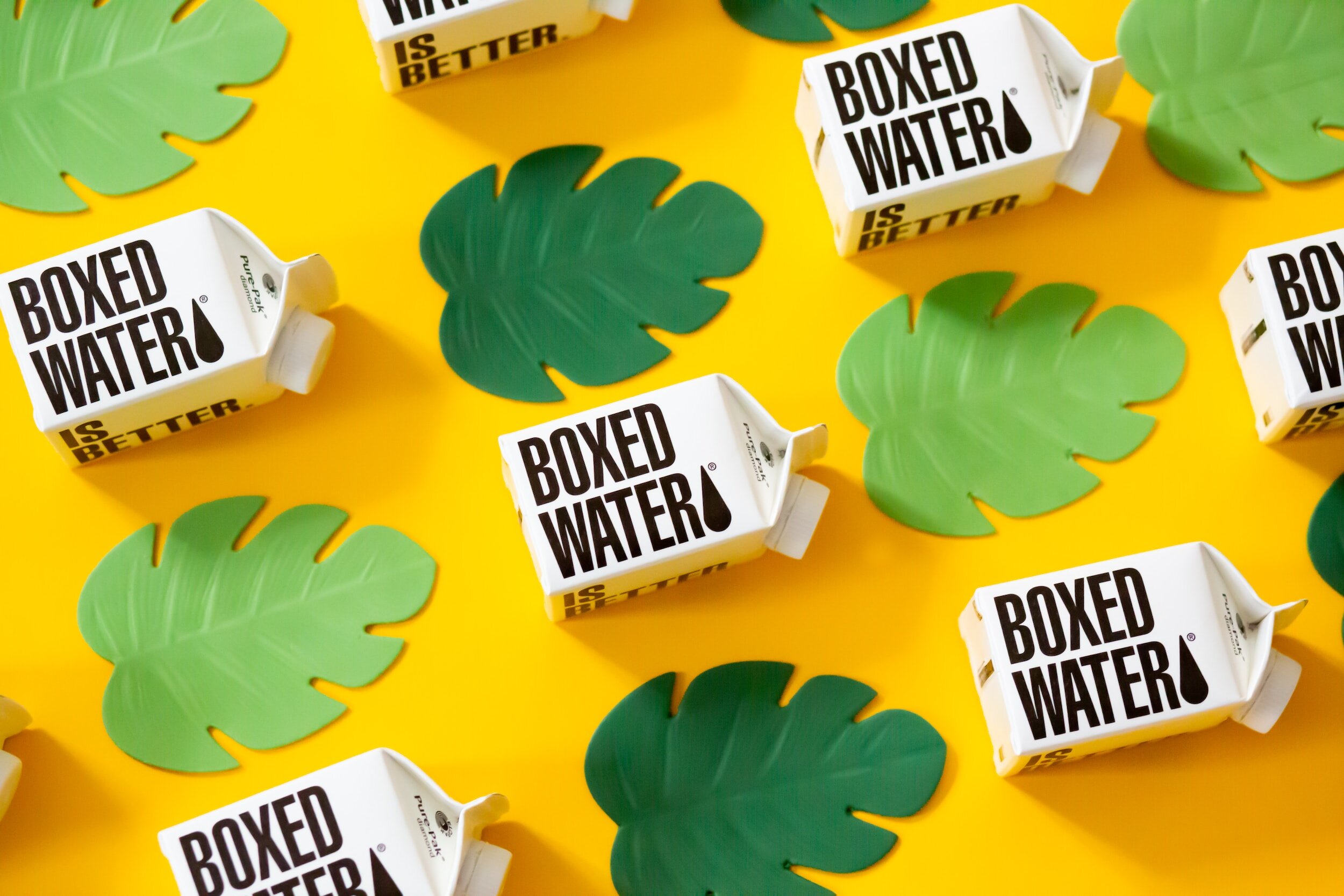
Colour Palette: Bright and vibrate tones combined with earthy tones (greens, blues, browns) with the signature Boxed Water blue to evoke a natural, eco-friendly feel.
Photography Style: High-quality, professional photographs with a focus on natural light to enhance the product's purity. Candid shots to capture authentic moments in a studio setting and mixed with real life elements.
Typography: Clean and modern fonts, with occasional handwritten elements for a personal touch.